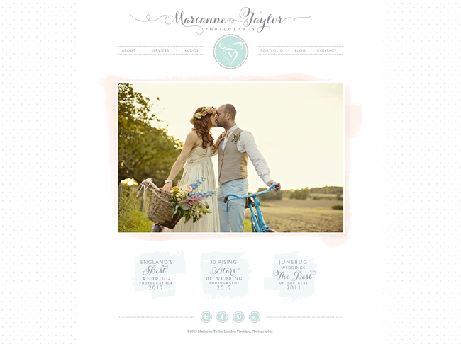
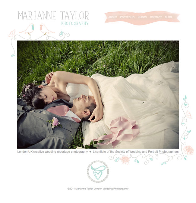
After months of planning and designing, many sleepless nights, and an all-nighter of a final push, the new site is finally live! Wahoo! I can’t begin to express how pleased I am with it all, and how much I love all the prettiness that the amazing Rose (of Rose & Ruby Paper Co.) created. From the moment I shot her wedding, or even long before the day itself, I fell in love with Rose’s sense of style. After she gravitated from fashion design to designing stationery and branding, I just knew that the time had come when my pictures and her design needed to be invited to the same party (well, we did have a bit of a warm-up bash last year).
I don’t really like the term ‘re-branding’ much, as it kind of implies a complete change of direction. I like to think more in terms of evolving a brand. The clearer your style and vision gets, the better you are able to communicate what you are about, and with that, your identity gets sharper. And while your brand evolves, I think that it’s equally important that the core feel of it remains familiar. Personally I think that’s what we’ve managed to achieve with Rose. I feel like the MTP brand has finally matured, but without losing the love for the pretty and cute, those will always be a part of my aesthetic – as are the colours that have followed me pretty much from the beginning.
Anyways, without further ado, do take a look around and make yourselves at home! There is still a bit of fine-tuning happening with the blog, but the main site is all there. Hopefully you will find it easy to navigate and pretty to look at. And do let us know what you think!

